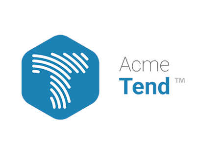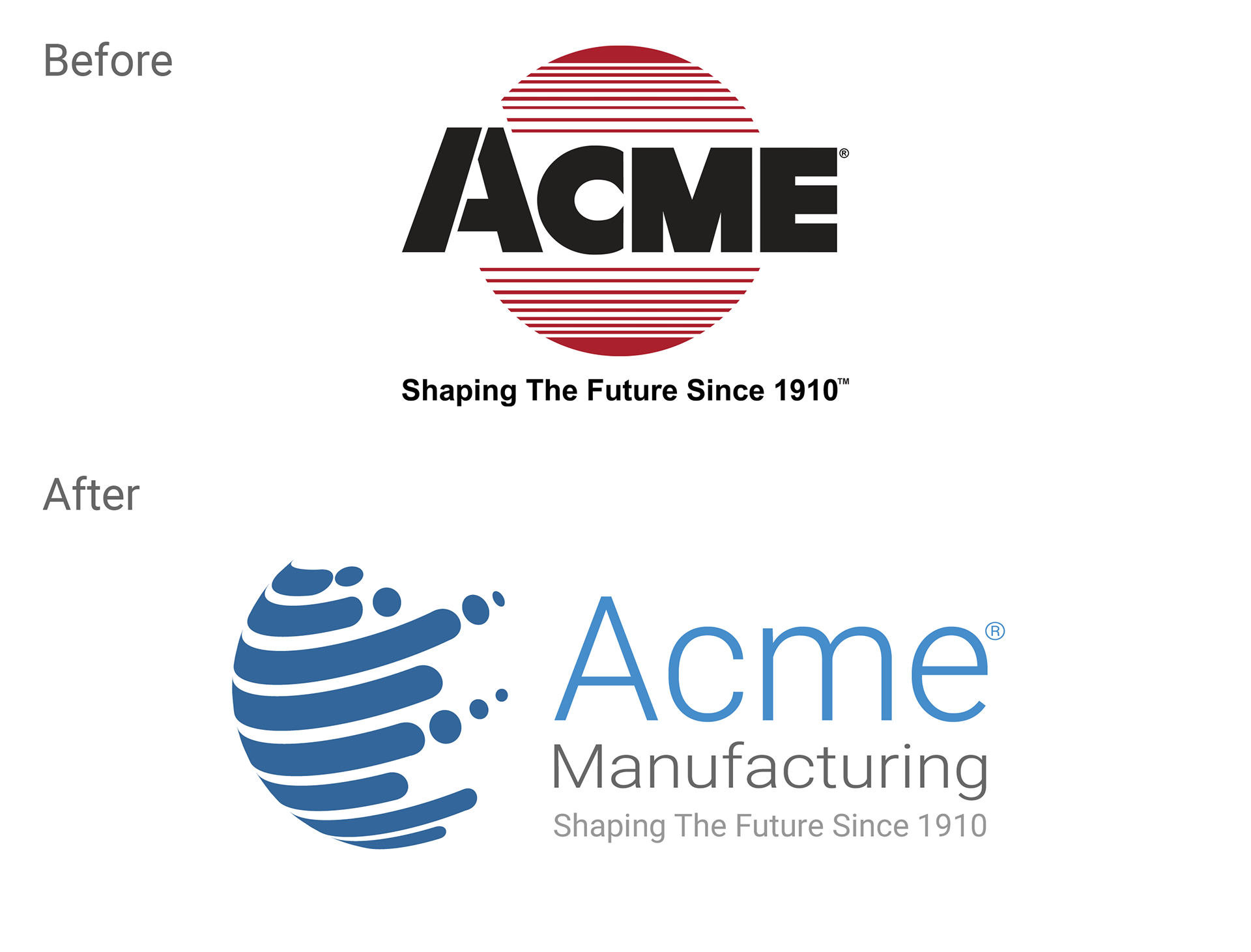
New logo design for Acme Manufacturing, 2021.
During the past year, Acme made many internal process changes that led to increased efficiency and more innovative solutions. This forward motion instigated the need for a new logo and branding to reflect the focus on perpetual innovation in a global market.
With the new logo, Acme states it wanted to preserve its legacy by retaining similar elements of its past designs. The globe shape stands out from the text, serving as a modern representation of Acme’s expanding global footprint. The clean “Roboto” font style aligns with the automation technology that Acme engineers. The tagline “Shaping the future since 1910” contains a clever double meaning; it references the company’s fourth generation of family ownership, along with the company’s specialty in shaping materials through grinding, polishing, buffing, and deburring.